
# Forza UI 0.3.3
# Use Forza with AI
Give your assistant the actual API, not a screenshot and a guessed component name.
## How this project is made
Forza UI is an independent project by Chrisdalbano, developed with AI assistance. Chrisdalbano sets the direction and reviews the visual experience. AI tools assist with research, implementation, documentation, and automated checks.
This includes AI-generated code and copy. The repository makes the implementation and checks available for inspection; it does not claim that every change has had an independent human code review.
## Machine-readable resources
- [component-manifest.json](/component-manifest.json): versioned props, defaults, required fields, events, slots, source paths, and usage examples.
- [llms.txt](/llms.txt): documentation entry points.
- [llms-full.txt](/llms-full.txt): guides and component reference in plain text.
- [AGENTS.md](https://github.com/Chrisdalbano/forza-ui/blob/main/AGENTS.md): contributor conventions.
- `forza list --json`: the same manifest bundled with the CLI.
API metadata is extracted from Vue source with Vue Language Tools. Examples and behavior notes are maintained alongside it. Run `npm run build:registry` after changing a contract.
## A useful prompt
```text
Use Forza UI 0.3.3 and Vue 3.5 with script setup and TypeScript.
Read https://forzaui.chrisdalbano.com/llms-full.txt and the component manifest.
Use documented exports only. Keep business state in the parent.
Import the stylesheet once and wrap the UI in .fz-theme.
Use controlled models, stable IDs, visible labels and explicit events.
Honor reduced motion. Do not add GSAP to application controls.
Use FzTable sort state to derive sorted rows in the parent.
Show your code and the checks you ran. Do not invent unsupported props.
```
## Boundaries
This release provides static documentation and a local CLI. It does not run an MCP server, send prompts to a model, or collect application data. A manifest is a reference, not permission to run arbitrary commands. Review generated code and test it against your application.
# Brand assets
Forza's **Forward Fold** symbol uses a forward-leaning spine, two open counters, and a displaced foot. It is drawn on a 128-unit grid and paired with an outlined display wordmark.
## Downloads
- [Coral symbol](/brand/symbol-coral.svg)
- [Ink symbol](/brand/symbol-ink.svg)
- [Paper symbol](/brand/symbol-paper.svg)
- [Ink wordmark](/brand/wordmark-ink.svg)
- [Paper wordmark](/brand/wordmark-paper.svg)
- [SVG favicon](/brand/favicon.svg) / ICO favicon
- [Social PNG](/brand/social.png) / [WebP](/brand/social.webp)
## Construction and usage
Keep clear space of at least one quarter of the symbol's width. Use the favicon variant at small sizes. Do not stretch or redraw the wordmark. Use Ink on light backgrounds and Paper on dark backgrounds. Coral is the primary accent.
The master lives in `brand/symbol-master.svg`. `scripts/brand.mjs` uses SVG.js and svgdom for vector construction, OpenType paths for lettering, SVGO for optimization, and Sharp for raster output. Regenerate with `npm run build:brand`. The ICO contains 16, 32, and 48px images. Touch icons are provided separately.
Lucide remains the functional icon set. The symbol identifies Forza; controls use familiar, consistent pictograms.
Forza source and symbol geometry are MIT licensed. Font-derived lettering retains the SIL Open Font License; see [font notices](/licenses/barlow-condensed-OFL.txt) and [Manrope notices](/licenses/manrope-OFL.txt). Please do not imply an official release or endorsement. Forza UI is independent of Riot Games and Microsoft/Turn 10.
# BuildValue: Forza in an application
[Open BuildValue](https://buildvalue.chrisdalbano.com) ยท [Explore Forza components](/components)
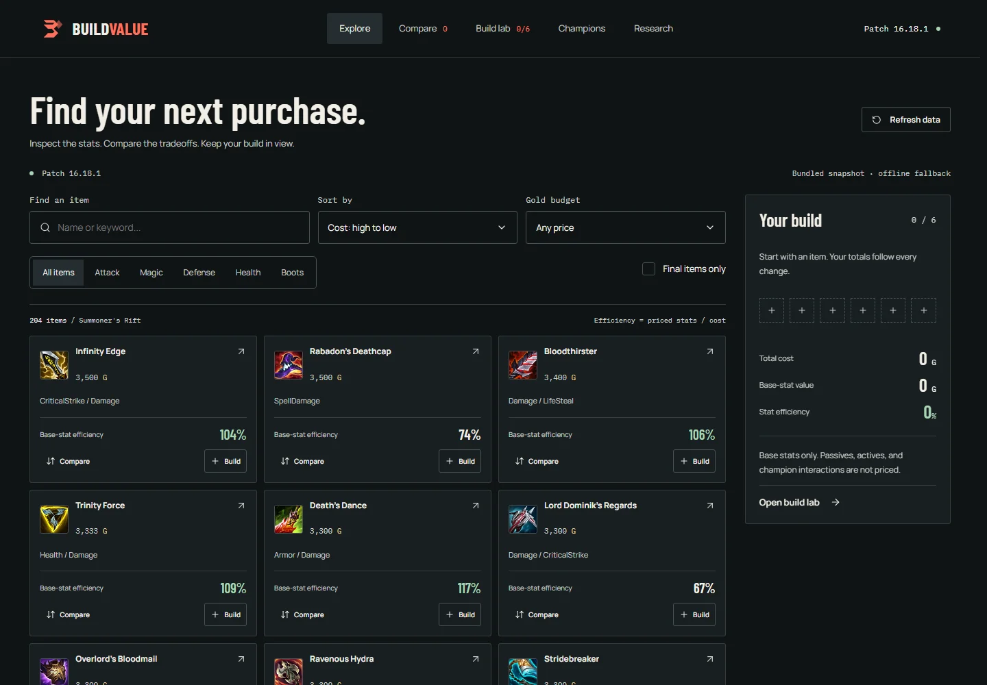
BuildValue is a League of Legends item workspace by Chrisdalbano. It uses the published `@chrisdalbano/forza-ui` package for its controls and overlays. Game data and calculations belong to the application and its existing backend.
## What the integration covers
- Search and filter items while keeping a six-slot build visible.
- Compare costs, stats, and descriptions against a selected baseline.
- Save named builds locally, undo draft changes, and share item-ID links.
- Preview item details on hover or keyboard focus, then inspect recipes and cached effect studies in a drawer.
- Switch between cards and a dense table, search by stat, swap selected items, and rename saved builds.
- Explore champion studies and research, with generated hypotheses labeled separately from calculated values.
- Find a starting build within a budget using backend-calculated base-stat values.
This is an independent application, not an endorsement or collaboration with Riot Games. It was developed with AI assistance, including generated code and copy.
## Component boundaries
| Responsibility | Forza supplies | BuildValue owns |
| --- | --- | --- |
| Search and filters | `FzField`, `FzSelect`, `FzSegmented`, `FzCheckbox` | Query state and derived results |
| Item actions | `FzButton`, `FzIcon` | Add, compare, and inspect actions |
| Build mutations | `FzList` | Stable IDs, six-slot limit, totals, undo |
| Item details | `FzDrawer`, `FzBadge` | Recipe and analysis content |
| Save and share | `FzDialog`, `FzField` | Storage, validation, clipboard feedback |
| Budget planning | `FzSlider`, `FzSelect` | Budget constraints and selection algorithm |
| Catalog paging | `FzPagination` | Filtered count and sliced results |
| Loading and failure | `FzAlert`, button loading state | Requests, cancellation, retry |
The integration uses the existing library contracts. It does not add League-specific props or dependencies to Forza.
## Install and scope the theme
```bash
npm install @chrisdalbano/forza-ui
```
```vue
```
BuildValue reserves scrollbar space with `scrollbar-gutter: stable`. The provider disables duplicate body compensation. Focus trapping and scroll locking remain active. Keep theme ancestors free of transforms and clipping; clip decorative landing artwork inside its own section.
## Keep application state outside controls
The workspace provider owns item IDs and named builds. Components receive typed data and call explicit actions. Totals and filtered lists are computed from the catalog and selection; they are not stored as competing copies.
```vue
{{ item.name }}Remove
Choose an item to start.
```
The full application also validates stored IDs, limits selection to six unique items, catches storage failures, and maintains an undo snapshot. Existing saved builds are migrated without deleting the old storage record.
## Data and motion
BuildValue displays the backend's calculated item values. Its bundled fallback is a captured API response with a patch and timestamp, not invented demo data. AI-generated effect estimates remain separate from formula-based totals.
GSAP is loaded only by the landing components. Application controls use Forza's motion behavior. Landing animations clean up on navigation and respect reduced motion. Repeatedly opening a study reads cached analysis; it does not trigger paid generation.
## Consumer checks
The application tests search, comparison, persistence, legacy migration, share validation, budget limits, analysis handoffs, overlay geometry, and keyboard focus restoration. It also checks seven routes at mobile, tablet, and desktop widths and exercises the built app offline.
These are consumer checks, not a claim that every possible application or assistive technology has been tested. Run the same kinds of checks against your own data and workflows.
## Preserve application features during a redesign
A component migration needs a feature checklist alongside the new design. BuildValue's first Forza pass omitted hover previews and parts of the AI explanation, even though the backend and main routes still worked. A follow-up source comparison restored those interactions and added regression checks.
The application composes Reka HoverCard primitives into an item-specific preview using Forza tokens. Hovering is read-only and performs no AI request. Pointer transit keeps the preview open while it is being read, Escape dismisses it, and touch users open the full item details with one tap. This wrapper lives in BuildValue; it is not an exported Forza component.
The AI panel renders returned estimates, alternative stat equivalents, reasoning, confidence, and champion explanations. Pending, failed, empty, and ready results have distinct presentations. Estimates remain separate from the formula-based totals. Tests cover these states with fixtures; production-preview checks also use real cached responses.
# CLI
The CLI copies source into your project. It resolves local component imports, includes shared tokens, and adds exports to an index file. It does not run remote scripts or install dependencies.
## Install
::: code-group
```sh [npm]
npm install -D @chrisdalbano/forza-ui-cli
npx forza init
npx forza add button field dialog
```
```sh [pnpm]
pnpm add -D @chrisdalbano/forza-ui-cli
pnpm exec forza init
pnpm exec forza add button field dialog
```
```sh [Yarn]
yarn add -D @chrisdalbano/forza-ui-cli
yarn forza init
yarn forza add button field dialog
```
```sh [Bun]
bun add -d @chrisdalbano/forza-ui-cli
bunx forza init
bunx forza add button field dialog
```
:::
For a one-off command without a local CLI dependency:
```sh
npx @chrisdalbano/forza-ui-cli@0.3.3 init
```
The CLI is separate from the prebuilt library package. Use it when you want component source inside your project; you do not need both distribution methods.
`init` writes `forza.config.json`. The default destination is `src/components/forza`. For Nuxt 4:
```sh
npx forza init --dir app/components/forza
npx forza add button drawer
```
## Commands
| Command | Behavior |
| ------------------------------- | ----------------------------------------- |
| `forza --version` | Print the installed CLI version |
| `forza list` | List components |
| `forza list --json` | Read the versioned API manifest |
| `forza init --dir src/ui/forza` | Set the source destination |
| `forza add button dialog` | Copy components and local dependencies |
| `forza add drawer --dry-run` | Validate without writing |
| `forza add drawer --force` | Explicitly replace edited component files |
| `forza doctor` | Check config and peer declarations |
| `--cwd path/to/app` | Target another project |
Unknown names and paths outside the project are rejected. Local edits stop the add operation before writing. Identical files can be added again. The CLI never removes files.
## After copying
Install the peers listed by `init`, then import your generated local barrel:
```ts
import { FzButton, FzDialog } from "./components/forza";
```
The source barrel imports tokens. Keep the `.fz-theme` wrapper. You own copied files; updates are explicit.
## Run from a checkout
```sh
npm ci
npm run build:registry
node packages/cli/bin/forza.mjs init --cwd ../my-app
node packages/cli/bin/forza.mjs add button --cwd ../my-app
```
# Installation
Forza requires Vue 3.5 or later. Install the library from the npm registry with your preferred package manager.
## Package managers and registry status
Forza is published as `@chrisdalbano/forza-ui`. The package contains ESM JavaScript, TypeScript declarations, CSS, and Vue source. The source-copy CLI is available separately as `@chrisdalbano/forza-ui-cli`.
npm, pnpm, Yarn, and Bun are package managers. They install the same package from the npm registry; pnpm does not require a separate Forza publication. Choose the command for your application below.
## Install the release
::: code-group
```sh [npm]
npm install @chrisdalbano/forza-ui
```
```sh [pnpm]
pnpm add @chrisdalbano/forza-ui
```
```sh [Yarn]
yarn add @chrisdalbano/forza-ui
```
```sh [Bun]
bun add @chrisdalbano/forza-ui
```
:::
To pin this release, use `@chrisdalbano/forza-ui@0.3.3`. Versioned archives remain available on [GitHub Releases](https://github.com/Chrisdalbano/forza-ui/releases/tag/v0.3.3).
npm installs the declared peers. If your package manager requires explicit peers:
```sh
npm install vue reka-ui @lucide/vue @formkit/auto-animate embla-carousel-vue
```
## Add the stylesheet and theme wrapper
Import the stylesheet once in your application entry:
```ts
import "@chrisdalbano/forza-ui/style.css";
```
```vue
Save build
```
The theme wrapper is required. Floating overlays inherit its theme. For Paper, add `data-theme="paper"`. Fonts belong to your application; system fallbacks work without font requests. See [theming](/guide/theming).
## Build locally
```sh
git clone https://github.com/Chrisdalbano/forza-ui.git
cd forza-ui
npm ci
npm run build:lib
npm pack ./packages/vue
```
Install the resulting tarball into your app. The release contains ESM, declarations, CSS, source, and license notices. Marketing code and GSAP are excluded.
# Forza UI
Forza is a Vue component library for application interfaces. It combines a distinct visual language with typed props, controlled state, and reusable composition patterns.
## What is included
- 25 Vue components using Composition API and TypeScript.
- Ink and Paper themes with scoped CSS custom properties.
- Keyboard behavior and focus management through Reka UI.
- Lucide icons, Embla carousels, and AutoAnimate list motion.
- A source-copy CLI, machine-readable API manifest, and agent instructions.
## Design and ownership
Forza UI is an independent project by Chrisdalbano, developed with AI assistance. Its components grew out of a design exploration for BuildValue. The source is MIT licensed. It is not affiliated with Riot Games.
## Choose your workflow
[Install the package](/guide/installation) for shared updates. Use the [CLI](/guide/cli) when you want to own and edit the source. Explore every component in the [playground](/playground).
This is an early 0.x release. Review changes before upgrading. Screen-reader certification and a broad browser matrix are not claimed.
# Motion and accessibility
Motion should explain a change without delaying it. Models update immediately; the presentation catches up.
## Component behavior
- Dialogs and drawers use separate entrance and exit timings. Focus returns to the opener.
- Selects and menus use Reka's keyboard behavior and collision handling.
- Lists animate addition, removal, and movement through AutoAnimate. Removed rows are inert while leaving.
- Carousels use Embla, explicit controls, and no autoplay.
- Tabs and segmented controls animate their selection indicator.
Forza honors `prefers-reduced-motion`, including preference changes while the page is open. The landing uses GSAP separately. It is never a runtime dependency of the component package.
## Your responsibilities
Supply meaningful labels and titles. Keep stable IDs. Announce asynchronous results. Restore focus when your app removes a focused item. Do not rely on color alone. Put essential instructions outside tooltips.
Automated browser and axe checks help catch regressions. They do not replace testing with a screen reader, touch input, zoom, and actual content. No WCAG certification is claimed.
## Scroll behavior
The site keeps native scrolling, with themed visible scrollbars. Desktop scenes respond to scroll position; narrow screens use explicit controls. Decorative sequences do not lock scrolling. Modal overlays lock the background only while open.
# Vue and Nuxt
Forza uses Vue 3.5 primitives and contains no application router, API client, or global store. Explicitly import components into Vue and Nuxt pages.
## Nuxt package integration
```ts
// nuxt.config.ts
export default defineNuxtConfig({
css: ["@chrisdalbano/forza-ui/style.css"],
});
```
```vue
```
```vue
Start building
```
## Source-copy integration
Use `forza init --dir app/components/forza`. Explicitly import from `~/components/forza` to avoid relying on generated component naming.
## Server rendering
Browser APIs run after mount. Overlay portals resolve the nearest theme wrapper on the client. Keep dialogs closed during initial SSR unless your flow handles client-only content. `useId` keeps control IDs stable.
Verified with a Nuxt 4.5.2 production build: server-rendered content, client hydration, field editing, a select inside a drawer, and restored opener focus. The reproducible consumer fixture lives in `tests/fixtures/nuxt`. No Nuxt auto-registration module is included in this version.
# Theming
Tokens have three layers: raw values, semantic roles, and component settings. Prefer changing a semantic role rather than restyling individual controls.
## Built-in themes
```html
Ink theme
Paper theme
```
| Token | Purpose |
| ---------------- | ------------------------------ |
| `--fz-bg` | Application background |
| `--fz-surface` | Panels and overlays |
| `--fz-raised` | Hover and elevated surfaces |
| `--fz-text` | Primary text |
| `--fz-muted` | Supporting text |
| `--fz-border` | Control and surface boundaries |
| `--fz-accent` | Primary actions and focus |
| `--fz-on-accent` | Text on primary actions |
| `--fz-positive` | Success feedback |
| `--fz-warning` | Caution feedback |
| `--fz-info` | Informational feedback |
## Customize a theme
```css
.fz-theme.my-product {
--fz-accent: #a8d6b5;
--fz-accent-hover: #c0e7cb;
--fz-on-accent: #101416;
--fz-font-body: "Inter", system-ui, sans-serif;
--fz-font-display: "Inter", system-ui, sans-serif;
--fz-font-mono: ui-monospace, monospace;
}
```
Check contrast after changing colors. A theme wrapper should not clip overflow or use a transform: portals mount into the closest wrapper, and transforms change the containing block for fixed overlays.
## Typography
The site self-hosts Manrope, Barlow Condensed, and IBM Plex Mono. The package does not download fonts. Choose fonts in the host app and set the three font tokens. Supporting text on the presentation site uses a readable 14 to 18px scale.
## Motion tokens
`--fz-motion-fast` is 160ms, `--fz-motion-layout` 260ms, `--fz-motion-enter` 320ms, and `--fz-motion-exit` 180ms. Override them on your wrapper. Reduced-motion settings take precedence.
## Stable page layout with overlays
If your application reserves scrollbar space with `scrollbar-gutter: stable`, disable Reka's extra body padding at the app root. Scroll locking and focus management remain enabled.
```vue
```
Without a stable gutter, keep Reka's default compensation. Combining a reserved gutter with padding compensation shifts the page twice. The Forza documentation site uses the setup above.
# Why Forza?
Forza is a styled Vue library for teams that want its visual direction: condensed display typography, compact geometry, a restrained accent palette, and coordinated interaction states. You can install the package or copy source with the CLI.
It is an early library. Choose it because the components fit your application, not because it claims to replace every alternative.
## How this project is made
Forza UI is an independent project by Chrisdalbano, developed with AI assistance. Chrisdalbano sets the direction and reviews the visual experience. AI tools assist with research, implementation, documentation, and automated checks.
This includes AI-generated code and copy. The repository makes the implementation and checks available for inspection; it does not claim that every change has had an independent human code review.
## Compared with shadcn-vue
| Decision | Forza UI | shadcn-vue |
| --- | --- | --- |
| Starting point | A defined visual and motion language | A broader foundation you adapt into your own system |
| Styling | Scoped CSS variables; no Tailwind requirement | Tailwind-based styling with CSS-variable theming |
| Component interface | Higher-level wrappers with props, slots, and parent-owned state | More primitive composition and a wider range of components |
| Delivery | npm package, versioned GitHub releases, or source-copy CLI | Source installation and an established registry ecosystem |
| Current scope | 25 components in an early 0.x release | A substantially broader catalog, including calendars, command menus, and sidebars |
Both offer editable source, typed Vue code, and accessible primitives through Reka UI. Source ownership, CSS variables, and AI-readable code are not exclusive advantages of Forza. Neither primitive selection nor automated checks removes the need to test accessibility in your finished application.
Forza's distinction is the set of design decisions supplied together. Its smaller API can make common compositions direct; it can also be limiting when you need behavior the wrapper does not expose. Inspect the component API before committing to it.
## Choose Forza when
- Its typography, density, colors, and feedback suit your product.
- You prefer props-driven components and CSS tokens without adopting Tailwind.
- The existing catalog covers your first workflows and you can maintain an early dependency.
Choose shadcn-vue when breadth, registry integrations, or more direct primitive composition matter more than Forza's supplied visual treatment. There is no universal winner.
## What is available today
The [component index](/components) and [workbench](/playground) use the current library catalog. The library and source-copy CLI are published to npm. Versioned GitHub Release assets are also available. The [installation guide](/guide/installation) contains the supported commands.
The marketing site's GSAP choreography is separate from the library. Installing a button does not install the landing page's animation system. Component motion uses CSS, Reka primitives, AutoAnimate for list changes, and Embla for the carousel where appropriate.
## References
This comparison is based on shadcn-vue's own [introduction](https://www.shadcn-vue.com/docs/introduction), [component catalog](https://www.shadcn-vue.com/docs/components), [theming guide](https://www.shadcn-vue.com/docs/theming), and [registry directory](https://www.shadcn-vue.com/docs/directory), reviewed September 17, 2026. Both projects will continue to change.
# FzButton
State belongs to the parent. Compose this component with the props and slots below.
{"props":[{"name":"variant","type":"\"primary\" | \"secondary\" | \"ghost\" | undefined","required":false,"default":"\"primary\""},{"name":"size","type":"\"md\" | \"sm\" | undefined","required":false,"default":"\"md\""},{"name":"disabled","type":"boolean | undefined","required":false,"default":null},{"name":"loading","type":"boolean | undefined","required":false,"default":null},{"name":"type","type":"\"button\" | \"submit\" | \"reset\" | undefined","required":false,"default":"\"button\""}],"events":[],"slots":[{"name":"default","type":"{}"},{"name":"trailing","type":"{}"}]}
```vue
Save build
```
# FzField
State belongs to the parent. Compose this component with the props and slots below.
{"props":[{"name":"label","type":"string","required":true,"default":null},{"name":"hint","type":"string | undefined","required":false,"default":null},{"name":"error","type":"string | undefined","required":false,"default":null},{"name":"placeholder","type":"string | undefined","required":false,"default":null},{"name":"disabled","type":"boolean | undefined","required":false,"default":null},{"name":"type","type":"\"text\" | \"search\" | \"email\" | undefined","required":false,"default":null},{"name":"modelValue","type":"string","required":true,"default":null}],"events":[{"name":"update:modelValue","type":"[value: string]"}],"slots":[{"name":"leading","type":"{}"},{"name":"trailing","type":"{}"}]}
```vue
```
# FzSelect
Single string selection. Supply a visible label. Disabled options are unavailable to keyboard and pointer input.
{"props":[{"name":"label","type":"string","required":true,"default":null},{"name":"options","type":"readonly ForzaOption[]","required":true,"default":null},{"name":"placeholder","type":"string | undefined","required":false,"default":"\"Choose an option\""},{"name":"disabled","type":"boolean | undefined","required":false,"default":null},{"name":"name","type":"string | undefined","required":false,"default":null},{"name":"modelValue","type":"string","required":true,"default":null}],"events":[{"name":"update:modelValue","type":"[value: string]"}],"slots":[]}
```vue
```
# FzCheckbox
State belongs to the parent. Compose this component with the props and slots below.
{"props":[{"name":"label","type":"string","required":true,"default":null},{"name":"description","type":"string | undefined","required":false,"default":null},{"name":"disabled","type":"boolean | undefined","required":false,"default":null},{"name":"name","type":"string | undefined","required":false,"default":null},{"name":"modelValue","type":"boolean | \"indeterminate\"","required":true,"default":null}],"events":[{"name":"update:modelValue","type":"[value: boolean | \"indeterminate\"]"}],"slots":[]}
```vue
```
# FzSlider
One numeric thumb. Arrow keys change by step; Home and End reach the bounds. The commit event marks completion.
{"props":[{"name":"label","type":"string","required":true,"default":null},{"name":"min","type":"number | undefined","required":false,"default":"0"},{"name":"max","type":"number | undefined","required":false,"default":"100"},{"name":"step","type":"number | undefined","required":false,"default":"1"},{"name":"disabled","type":"boolean | undefined","required":false,"default":null},{"name":"unit","type":"string | undefined","required":false,"default":"\"\""},{"name":"name","type":"string | undefined","required":false,"default":null},{"name":"modelValue","type":"number","required":true,"default":null}],"events":[{"name":"update:modelValue","type":"[value: number]"},{"name":"commit","type":"[value: number]"}],"slots":[]}
```vue
```
# FzSwitch
State belongs to the parent. Compose this component with the props and slots below.
{"props":[{"name":"label","type":"string","required":true,"default":null},{"name":"disabled","type":"boolean | undefined","required":false,"default":null},{"name":"modelValue","type":"boolean","required":true,"default":null}],"events":[{"name":"update:modelValue","type":"[value: boolean]"}],"slots":[]}
```vue
```
# FzSegmented
State belongs to the parent. Compose this component with the props and slots below.
{"props":[{"name":"label","type":"string","required":true,"default":null},{"name":"options","type":"readonly { value: string; label: string; }[]","required":true,"default":null},{"name":"modelValue","type":"string","required":true,"default":null}],"events":[{"name":"update:modelValue","type":"[value: string]"}],"slots":[]}
```vue
```
# FzTabs
The default slot renders the active panel. The parent owns its content. Arrow keys, Home, and End move selection.
{"props":[{"name":"label","type":"string","required":true,"default":null},{"name":"options","type":"readonly { value: string; label: string; }[]","required":true,"default":null},{"name":"modelValue","type":"string","required":true,"default":null}],"events":[{"name":"update:modelValue","type":"[value: string]"}],"slots":[{"name":"default","type":"{ value: string; }"}]}
```vue
{{ tab }}
```
# FzStepper
Steps begin at 1. The parent owns validation and content panels. Disable steps until prerequisites are satisfied. Linear mode prevents jumping ahead of the next step.
{"props":[{"name":"steps","type":"readonly ForzaStep[]","required":true,"default":null},{"name":"label","type":"string","required":true,"default":null},{"name":"linear","type":"boolean | undefined","required":false,"default":"true"},{"name":"modelValue","type":"number","required":true,"default":null}],"events":[{"name":"update:modelValue","type":"[value: number]"}],"slots":[]}
```vue
```
# FzPagination
State belongs to the parent. Compose this component with the props and slots below.
{"props":[{"name":"total","type":"number","required":true,"default":null},{"name":"pageSize","type":"number | undefined","required":false,"default":"5"},{"name":"label","type":"string | undefined","required":false,"default":"\"Pagination\""},{"name":"modelValue","type":"number","required":true,"default":null}],"events":[{"name":"update:modelValue","type":"[value: number]"}],"slots":[]}
```vue
```
# FzAccordion
Single, collapsible expansion. An empty model closes every item. Custom content belongs in the default scoped slot.
{"props":[{"name":"items","type":"readonly ForzaAccordionItem[]","required":true,"default":null},{"name":"label","type":"string","required":true,"default":null},{"name":"disabled","type":"boolean | undefined","required":false,"default":null},{"name":"modelValue","type":"string | undefined","required":false,"default":"\"\""}],"events":[{"name":"update:modelValue","type":"[value: string]"}],"slots":[{"name":"title","type":"{ item: ForzaAccordionItem; }"},{"name":"default","type":"{ item: ForzaAccordionItem; }"}]}
```vue
```
# FzCarousel
Slide indices begin at 0. Embla handles pointer and touch dragging. Inactive slides are inert. No autoplay. Items require stable IDs.
{"props":[{"name":"items","type":"readonly T[]","required":true,"default":null},{"name":"label","type":"string","required":true,"default":null},{"name":"modelValue","type":"number | undefined","required":false,"default":"0"}],"events":[{"name":"update:modelValue","type":"[value: number]"}],"slots":[{"name":"default","type":"{ item: T; index: number; }"}]}
```vue
{{ item.name }}
```
# FzDropdown
State belongs to the parent. Compose this component with the props and slots below.
{"props":[{"name":"label","type":"string","required":true,"default":null},{"name":"items","type":"readonly ForzaMenuItem[]","required":true,"default":null},{"name":"heading","type":"string | undefined","required":false,"default":null},{"name":"disabled","type":"boolean | undefined","required":false,"default":null},{"name":"open","type":"boolean | undefined","required":false,"default":"false"}],"events":[{"name":"update:open","type":"[value: boolean]"},{"name":"select","type":"[value: string]"}],"slots":[{"name":"trigger","type":"{}"}]}
```vue
```
# FzDialog
Escape closes the dialog. Focus is trapped while open and returned to the opener. Exit motion completes before unmount. Supply an informative title.
{"props":[{"name":"title","type":"string","required":true,"default":null},{"name":"description","type":"string | undefined","required":false,"default":null},{"name":"closeOnOutside","type":"boolean | undefined","required":false,"default":"true"},{"name":"placement","type":"\"center\" | \"right\" | \"bottom\" | undefined","required":false,"default":"\"center\""},{"name":"modelValue","type":"boolean","required":true,"default":null}],"events":[{"name":"update:modelValue","type":"[value: boolean]"}],"slots":[{"name":"default","type":"{ close: () => boolean; }"},{"name":"footer","type":"{ close: () => boolean; }"}]}
```vue
Your build is ready.
```
# FzDrawer
Shares the dialog focus contract. Right and bottom placement are supported. No drag dismissal in this release.
{"props":[{"name":"title","type":"string","required":true,"default":null},{"name":"description","type":"string | undefined","required":false,"default":null},{"name":"side","type":"\"right\" | \"bottom\" | undefined","required":false,"default":"\"right\""},{"name":"closeOnOutside","type":"boolean | undefined","required":false,"default":"true"},{"name":"modelValue","type":"boolean","required":true,"default":null}],"events":[{"name":"update:modelValue","type":"[value: boolean]"}],"slots":[{"name":"default","type":"{ close: () => boolean; }"},{"name":"footer","type":"{ close: () => boolean; }"}]}
```vue
Your filters.
```
# FzPopover
State belongs to the parent. Compose this component with the props and slots below.
{"props":[{"name":"label","type":"string","required":true,"default":null},{"name":"open","type":"boolean | undefined","required":false,"default":"false"}],"events":[{"name":"update:open","type":"[value: boolean]"}],"slots":[{"name":"trigger","type":"{}"},{"name":"default","type":"{ close: () => boolean; }"}]}
```vue
Three items selected.
```
# FzTooltip
Use one focusable trigger. Essential instructions should remain visible elsewhere.
{"props":[{"name":"text","type":"string","required":true,"default":null},{"name":"delay","type":"number | undefined","required":false,"default":"250"}],"events":[],"slots":[{"name":"default","type":"{}"}]}
```vue
```
# FzTable
Sorting is controlled: use the emitted sort value to sort or request rows in the parent. Pagination is separate. Supply unique row IDs. No virtualization in this release.
{"props":[{"name":"rows","type":"readonly T[]","required":true,"default":null},{"name":"columns","type":"readonly ForzaColumn[]","required":true,"default":null},{"name":"label","type":"string","required":true,"default":null},{"name":"sort","type":"ForzaSort | undefined","required":false,"default":null}],"events":[{"name":"update:sort","type":"[value: ForzaSort | undefined]"}],"slots":[{"name":"cell","type":"{ row: T; column: ForzaColumn; value: unknown; }"},{"name":"empty","type":"{}"}]}
```vue
```
# FzList
Use stable, unique item IDs. Mutate the parent array to add, remove, or reorder. Leaving rows become inert immediately.
{"props":[{"name":"items","type":"readonly T[]","required":true,"default":null},{"name":"label","type":"string","required":true,"default":null},{"name":"motionDisabled","type":"boolean | undefined","required":false,"default":null},{"name":"duration","type":"number | undefined","required":false,"default":null}],"events":[],"slots":[{"name":"default","type":"{ item: T; index: number; }"},{"name":"empty","type":"any"}]}
```vue
{{ item.name }}
No builds yet.
```
# FzAlert
State belongs to the parent. Compose this component with the props and slots below.
{"props":[{"name":"title","type":"string","required":true,"default":null},{"name":"tone","type":"\"info\" | \"success\" | \"warning\" | \"danger\" | undefined","required":false,"default":"\"info\""}],"events":[],"slots":[{"name":"default","type":"{}"}]}
```vue
Your changes are ready.
```
# FzBadge
State belongs to the parent. Compose this component with the props and slots below.
{"props":[{"name":"tone","type":"\"warning\" | \"neutral\" | \"positive\" | \"accent\" | undefined","required":false,"default":"\"neutral\""}],"events":[],"slots":[{"name":"default","type":"{}"}]}
```vue
Ready
```
# FzMeter
State belongs to the parent. Compose this component with the props and slots below.
{"props":[{"name":"value","type":"number","required":true,"default":null},{"name":"max","type":"number | undefined","required":false,"default":"100"},{"name":"label","type":"string","required":true,"default":null},{"name":"tone","type":"\"warning\" | \"positive\" | \"accent\" | undefined","required":false,"default":"\"positive\""}],"events":[],"slots":[]}
```vue
```
# FzStat
State belongs to the parent. Compose this component with the props and slots below.
{"props":[{"name":"label","type":"string","required":true,"default":null},{"name":"value","type":"string","required":true,"default":null},{"name":"detail","type":"string | undefined","required":false,"default":null}],"events":[],"slots":[]}
```vue
```
# FzPanel
State belongs to the parent. Compose this component with the props and slots below.
{"props":[{"name":"title","type":"string | undefined","required":false,"default":null},{"name":"eyebrow","type":"string | undefined","required":false,"default":null}],"events":[],"slots":[{"name":"action","type":"{}"},{"name":"default","type":"{}"},{"name":"footer","type":"{}"}]}
```vue
